
An entry on the new OED user interface
30 July 2023
The Oxford English Dictionary Online has undergone a major facelift. It’s still the same dictionary; the data is unchanged, but the user interface and the look and feel of the website is significantly different. I’ve seen a lot of kvetching by regular users of the dictionary about the changes, but on the whole, I think it’s a superb update, well thought out and executed.
My first reaction was horror, though. All too often, sites and software packages undergo revisions without any reason behind them, moving icons around the page for no apparent reason, etc. But after using the new OED for a week, I’ve come to embrace the changes.
For those who have never used it, the Oxford English Dictionary is without question the most comprehensive and best researched dictionary of the English language, if not any language. Its entries contain usage citations that outline a word’s history. If the OED has a significant drawback, it’s that it is so large and its editorial standards are so high, that it is slow to update. The editors do an admirable job with the resources at hand, but like an oil tanker, it is slow to change course. But with this change the dictionary has made a major course correction, at least in its user interface.
First and foremost, the new OED site works well with smartphones. The old site was clunky and hard to read on a small screen, but the new site is designed to function easily on a phone. I don’t know what the OED’s usage statistics are, but 72% of the visits to Wordorigins.org are from smartphones. I imagine the OED’s statistics are similar, and the dictionary should not ignore huge swaths of its user base. I do most of my work at a computer, with two screens and a mouse, but I occasionally use my phone to do a quick look up of a word, and the experience with the old interface was terrible, almost unusable. The new one is far superior on a phone or tablet.
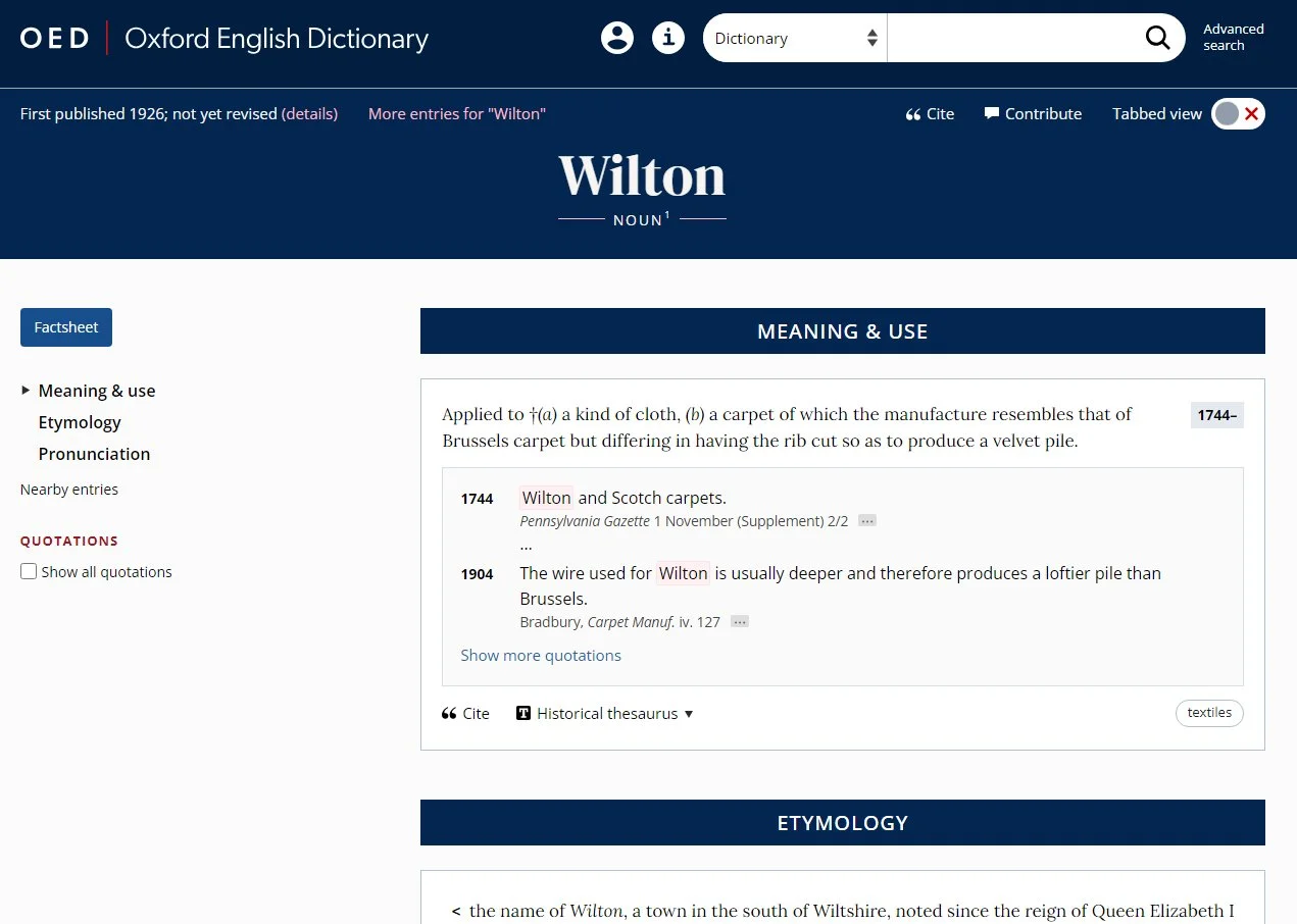
The second big change is the dictionary’s site now has a tabbed view as default. The tabs are:
Factsheet (a quick overview of the entry; technically not a tab but either a landing page or a pop-up window if you are logged in)
Meaning & Use (definitions)
Pronunciation
Forms
Frequency
Compounds & Derived Words
Users without a paid subscription (either individual or through an institution) have access to only the Factsheet. Subscribers who are not logged in also get the Factsheet as their landing page when they search for a word. Subscribers who are logged in get the Meaning & Use tab, the one with the definitions, as their landing page. And when one arrives at the Meaning & Use page, the usage citations are compressed by default, with only the earliest and latest citation for any given sense displayed; you must click to expand the window and see all the citations. This change reduces scrolling, which is especially welcome on mobile devices with small screens.
These two changes, the tabs and compressed citations, form the bulk of the complaints about the new interface that I’ve heard. But again, these were, I assume, put in place to make it easier for smartphone users. Scrolling through a long entry is relatively easy on a computer with a big screen and mouse but is a hassle on a phone or tablet. But if one likes everything on one page with no clicks to see details, that is available.
You can set up a personal account, which is distinct from your subscription status. You don’t need to have a subscription to have an account, and if you have access through an institutional subscription (e.g., through a library or university), your personal account is unconnected with your institution. In your account, you can set your preferences as to whether you want a tabbed view or everything on one page and whether usage citations are compressed or displayed in full. I’ve set my preferences to a single page with all citations shown, but I may switch to back to tabs and the compressed citations. I’m still trying to figure out which I prefer.
One improvement the OED could make is to allow users to have two sets of preferences, one for computers and one for mobile devices. Currently, you can only optimize the interface for one type of device. But there is a workaround: because the subscriber login is different from the personal account login, you can log into your personal account on your computer and not log in on your phone. This allows you change the display on your computer, leaving the phone at the default, which is optimized for mobile devices.
Another minor improvement is of inestimable help. With the old interface, it was easy to get lost among the senses in a long entry. They were numbered, but only the last character of the numbering was displayed alongside the sense. For instance, if you were looking at sense VII.91.c. for the verb set, only the c. was displayed next to the definition. You had to scroll, sometimes a great distance, to get the full number. With the new interface, the full designation is displayed next to the definition.
Another welcome improvement is that each page contains a “Contribute” link in the header that allows a user to submit comments, additions, or corrections to the entry. Previously, the contact link was buried in the “front-matter” and all but impossible to find.
But not all is perfect. There is an issue with logging in. If you have access via an institutional account, you must log in twice, once via the institution and once for your personal account, in order to use your saved preferences and searches. This would not be so problematic, except the OED automatically logs you out after 45 minutes—regardless of whether or not you are continuously active on the site. The logic behind this is clear; the Oxford UP doesn’t want the access to remain open on public computers. It is likely that the overwhelming number of users log in to look up a single word and remain online for only a few minutes at most. But there are power users, linguistic researchers, who are few in number but make up a significant portion of the total hours logged into the OED. For these, the most loyal and dedicated of the dictionary’s users, the login policy is a major inconvenience. This automatic logout policy needs to be changed. And the fix is easy—upon login require users to specify whether they are working from a personal or shared computer and set the cookie duration appropriately. Banks and financial institutions do this on their sites, and they process much more sensitive information than a dictionary ever would. And what is the harm of having a cookie remain viable for several hours? Some unauthorized user might get to look up an etymology without paying? It is neither a threat to security nor to the OED’s revenue stream.
Another problem is unrelated to the interface and is not new. That is the dictionary does not present a clear record of when and how an entry has been updated. Given that the OED’s entries vary in age, some having not been revised in over a century, and knowing exactly has been changed is often critical to researchers. For instance, the entry for set, v.1 says it was “first published in 1912; not yet revised,” but that it was also “last modified in April 2023.” It further gives the general statement that such modifications short of revision may include: “corrections and revisions to definitions, pronunciation, etymology, headwords, variant spellings, quotations, and dates; new senses, phrases, and quotations which have been added in subsequent print and online update.” This is too general a description to be of any help. If I am doing etymological work, I really would like to know if the etymology given in the entry was updated a few months ago or if it is over 110 years old. The dictionary needs a wiki-style revision-history tab for each entry.
And there is one other problem. It is minor and probably bothers no one except the ex-marketing person in me; it has to do with the OED’s logo. The old interface had the words Oxford English Dictionary displayed in a distinctive, serif typeface. The typeface was nothing special, but it was distinctive and instantly recognizable. The new interface has replaced this with a boring, utterly unremarkable, sans serif one. It is distinctive only in its amateurish look. The landing page when one is not logged in has a distinctive graphic resembling a starburst, a representation of a spiral data plot. It looks good, but it is not repeated anywhere else. The key to a good logo is that it is appears on everything related to the product. A miniature version of the data starburst should be at the top of every page with OED displayed in the old, instantly recognizable typeface, tying the storied history of the dictionary with advances in data science and visualization.
Still, the faults with the new interface are minor and the changes most welcome. I believe that those who are currently kvetching about the changes will, like me, come around to embrace them as they familiarize themselves with the new interface.
